JobCLoud - Enhancing job ad publishing with data-driven design
JobCLoud - Enhancing job ad publishing with data-driven design
As part of my work at JobCloud, I was part of the team behind Jobcloud.ai, our B2B job publication platform used by thousands of recruiters across Switzerland.
Our mission: streamline the job ad creation process, reduce confusion and errors, and increase publishing success, all without overloading users with information.
Thanks to a data-driven approach, I led a UX redesign that brought clarity, structure, and better outcomes to a critical business flow.
Have a look at the presentation video of the form enhancements
Have a look at the presentation video of the form enhancements
Context of the project
JobCloud.ai enables recruiters to publish job ads across major Swiss job boards (Jobs.ch, Jobup.ch, JobScout24).
While observing user behavior via analytics and Hotjar, I noticed many were skipping important fields, getting stuck, or contacting support unnecessarily.
We aimed to improve task completion, reduce errors, and make the publishing experience faster and more intuitive.
My role
Led the UX redesign of the job ad publication flow
Ran data analysis using Tableau, analytics, Hotjar, and support feedback
Designed a structured, guided form with clarity-focused UI
Introduced an e-commerce-style checkout
Created a prototype and help preparing the moderated usability tests to validate concepts

Discovery & Research
To uncover pain points, I took the initiative to explore both quantitative and qualitative sources:
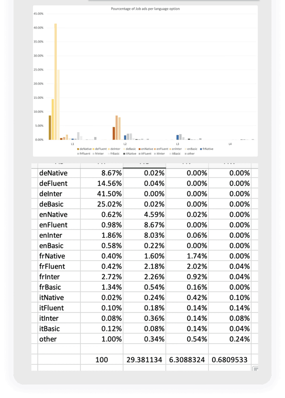
Analytics & dashboards (via Tableau and custom tracking) revealed high drop-off rates in key steps.
Hotjar session replays exposed erratic user behavior, repeated scroll up and down, skipped fields, and visible hesitation.
Customer support feedback pointed to frequent confusion around pricing, options, how to write a job ad and required fields.
This triangulation revealed a central issue: recruiters lacked guidance and confidence throughout the publishing flow, leading to delays, errors, and unnecessary support calls.
I also benchmarked e-commerce flows and other recruitment tools to inform best practices for progressive disclosure and form clarity.
To uncover pain points, I took the initiative to explore both quantitative and qualitative sources:
Analytics & dashboards (via Tableau and custom tracking) revealed high drop-off rates in key steps.
Hotjar session replays exposed erratic user behavior, repeated scroll up and down, skipped fields, and visible hesitation.
Customer support feedback pointed to frequent confusion around pricing, options, how to write a job ad and required fields.
This triangulation revealed a central issue: recruiters lacked guidance and confidence throughout the publishing flow, leading to delays, errors, and unnecessary support calls.
I also benchmarked e-commerce flows and other recruitment tools to inform best practices for progressive disclosure and form clarity.
Ideation & early concepts
I began by identifying friction points and analyzing patterns from analytics dashboards, Hotjar recordings, and customer feedback. Based on this, I proposed key structural and usability improvements.
I started by grouping form fields logically to create a clearer structure.
The original idea was to introduce a true step-by-step wizard to lower cognitive load, but due to technical and timeline constraints, I pivoted to a Typeform-style form, displaying grouped sections one at a time.
The goal was to balance user comfort with implementation feasibility, delivering a scalable and user-friendly design.

I add to extract, clean and analyse the data by myself
I add to extract, clean and analyse the data by myself
Design Process & Key Decisions
This project required aligning business goals, user needs, and technical limitations, all while improving an existing flow that was deeply integrated into recruiter workflows. My design approach combined data analysis, wireframing, usability testing, and collaboration with developers and other designers to deliver high-impact improvements.
This project required aligning business goals, user needs, and technical limitations, all while improving an existing flow that was deeply integrated into recruiter workflows. My design approach combined data analysis, wireframing, usability testing, and collaboration with developers and other designers to deliver high-impact improvements.
Job ad creation step improvements
I started by regrouping form fields to follow a more logical, task-oriented structure. While the initial idea was to introduce a true step-by-step flow, technical constraints led us to a Typeform-style layout, with sections revealed progressively on a single page.
To improve clarity and reduce cognitive load:
I added contextual helper texts
Proposed default values based on analysis of the most frequently selected options
Streamlined field interactions and optimized component behavior for speed and clarity
Products page redesign
I redesigned the product selection page to help users better understand the value of each option while reducing cognitive load.
To support clearer decisions:
I simplified the layout to highlight key differences and user benefits
Reduced the number of visible options at first glance to avoid overwhelming users
Used progressive disclosure to reveal details only when needed
Applied behavioral design principles to guide choices in an outcome-focused
This approach helped users make more confident selections while supporting business goals.
Checkout page redesign
User research had shown that the checkout page was confusing and hard to navigate. I quickly redesigned it using a familiar e-commerce-style layout to highlight:
Selected products and options
Pricing and billing details
A clear next step with strong visual hierarchy
The layout was modular, allowing easy future expansion (e.g., upsells, bundles, or subscription logic).
Outcome
Although the redesign launched alongside other product updates, making it difficult to isolate specific metrics, qualitative and behavioral indicators confirmed the impact:
Error rates dropped significantly, especially in the form submission step
Users navigated with more confidence, as observed in Hotjar session replays
Support requests related to job ad publishing decreased noticeably
Internally, the work was well received by both product and support teams. The modular approach and alignment with our design system also made future iterations easier to implement.
This project strengthened our platform’s usability while balancing user needs, business priorities, and technical constraints.
We also redesigned the flow for publishing a draft, previewing the job ad, and making edits aiming for better clarity and control at each step.
What I learned
This project reinforced the value of using data to drive design decisions, especially in complex, form-heavy workflows. By digging into analytics and user behavior, I was able to prioritize improvements that had real impact.
It also taught me how to:
Balance ideal UX solutions with technical constraints, adapting designs pragmatically without losing sight of user needs
Collaborate across functions, especially when coordinating changes to shared systems like design libraries
Design for scalability, building modular components and flows that could evolve with the product
Finally, it confirmed how small UX decisions, like field order, guidance text, or smart defaults, can dramatically improve both usability and efficiency.