Youma - Rethinking job search for Gen Z (app design)

Youma - Rethinking job search for Gen Z (app design)

Youma is a mobile job platform built for Gen Z, launched by JobCloud to explore new ways of engaging younger job seekers. The goal was to create a more intuitive, modern experience that addresses the common frustrations of entry-level candidates, especially ghosting and irrelevant job listings.

Discover the my presentation video of the MVP protoype made in figma

Discover the my presentation video of the MVP protoype made in figma

Context of the project

I was the sole UX designer on the project and worked closely with the product manager, engineering manager, and developers throughout the full product lifecycle. Over four months, I led everything from research and ideation to high-fidelity design, testing, and handoff, helping bring a brand-new product to market on a tight timeline.


This case study walks through how I shaped the concept, tested multiple directions, and ultimately designed a chat-driven job application experience tailored to Gen Z expectations.


Note : The mascot evolved during development, so you’ll see both the old and new versions in the video and images.

My role

I led the full UX design process:


  • Ran interviews & surveys with Gen Z users

  • Participated to a design sprint to define the MVP

  • Facilitated a design sprint on how to monetize the application

  • Explored and tested how to combine visuals and relevant information

  • Designed low- and high-fidelity prototypes

  • Conducted two rounds of usability testing

  • Delivered production-ready UI, motion specs

  • Created marketing assets (Framer site, promo video, slides)

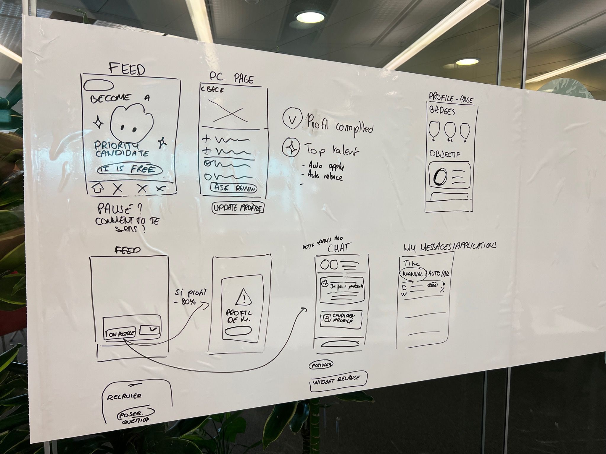
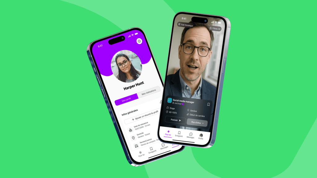
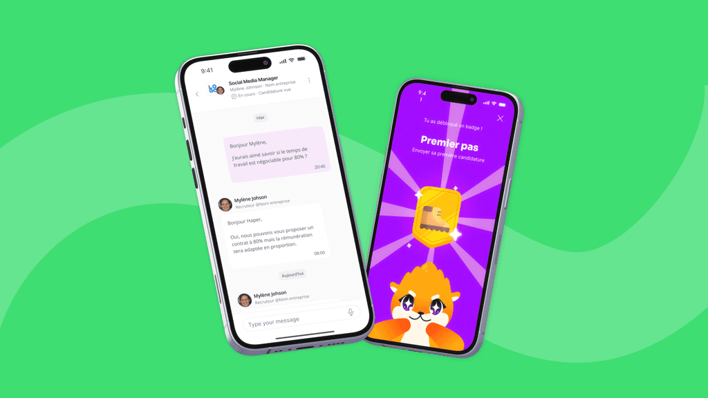
Some of the main screens (onboarding, feed, job ad detail and chat with recruiter)

Discovery & Research

We began with interviews, focus groups and short surveys to understand user pain points.
Two patterns emerged quickly:

  1. Uncertainty – Users felt ghosted and had no visibility post-application.

  2. Mismatch – Many couldn’t find junior-friendly offers easily.

Interesting insight: We discovered that many Gen Z users don’t search for their first job entirely on their own. They often rely on their parents to guide them or help activate their network. This led us to shape our tone of voice and certain features to feel more reassuring, encouraging, and supportive throughout the experience.

Ideation & early concepts

From the start, we wanted Youma to feel personalized, modern, and emotionally engaging, far from the cold, transactional job boards Gen Z tends to avoid. We aimed to design something that felt closer to the tools they use daily: social apps that are conversational, intuitive, and human.

We defined a few core principles to guide the product:


  • Personalization – onboarding tailored to the user’s values and context


  • Simplicity – a chat-like application flow to reduce friction


  • Tone of voice – inspired by kindness, using encouraging language and soft prompts


  • Transparency – features like application status updates to reduce ghosting and build trust


  • Local relevance – helping users discover nearby, relevant opportunities quickly


These principles shaped early concepts around layout, language, and flow, from onboarding questions to job presentation style, and set the tone for all future design decisions.

We ideated together, after which I summarized the ideas and created a wireframe.

We ideated together, after which I summarized the ideas and created a wireframe.

Design process & key decisions

With the core principles in place, I moved into translating them into tangible flows and UI. Some screens, like job details, came together quickly, inspired by familiar patterns such as traditional job boards and the Google Maps side panel, helping users project themselves into a role. Others required deeper iteration.

With the core principles in place, I moved into translating them into tangible flows and UI. Some screens, like job details, came together quickly, inspired by familiar patterns such as traditional job boards and the Google Maps side panel, helping users project themselves into a role. Others required deeper iteration.

Onboarding: finding the right balance

The challenge was to design something light and engaging without losing credibility. I kept the onboarding short but meaningful, asking a few targeted questions to personalize job results while setting the tone with prompts like:

  • “What are your red flags at work?”

  • “How do you want to feel in your next job?”

We refined visual tone, microcopy, and pacing to feel human but not childish. Subtle motion and emojis were tested and kept where they added clarity or personality.

Feed navigation: scrolling vs. swiping

One of the biggest UX decisions involved how to present job listings:

  • Option A: A traditional, scrollable feed (Instagram-style)

  • Option B: A TikTok/Youtube Shorts-style one-by-one swipe interface

I prototyped both and tested them with target users alongside the PM. The swipe version clearly resonated: it felt more modern, helped focus on each job individually, and aligned well with our short onboarding and personalized results.

CTA & hierarchy: Apply vs. More info

The PM and I debated whether to prioritize the “Apply” button or more job details. Based on early survey results, I argued users needed context before committing, especially since intro videos weren’t always enough.

The final layout prioritized clarity: we surfaced the most important criteria (location, contract type, experience) first, with “Apply” always accessible, but not forced.

Outcome

We conducted user interviews and surveys to evaluate users satisfaction and our product/market fit. When asked why they use it, users cite the concept and, above all, its easy and intuitive design as their top reasons. The only downside identified so far is the lack of content. The app is now growing rapidly.

We conducted user interviews and surveys to evaluate users satisfaction and our product/market fit. When asked why they use it, users cite the concept and, above all, its easy and intuitive design as their top reasons. The only downside identified so far is the lack of content. The app is now growing rapidly.

I made a video to share user test outcomes before launching the app live

I made a video to share user test outcomes before launching the app live

What I learned

Being fully involved in product development gave me a deeper understanding of its various aspects and constraints. With greater involvement in product decisions, I improved my negotiation and communication skills. Finally, I expanded my UX design toolkit by acquiring new skills in no-code web development, marketing, 3D modeling, and AI (LLM) comprehension.

Being fully involved in product development gave me a deeper understanding of its various aspects and constraints. With greater involvement in product decisions, I improved my negotiation and communication skills. Finally, I expanded my UX design toolkit by acquiring new skills in no-code web development, marketing, 3D modeling, and AI (LLM) comprehension.